Tag Archives: Birthday

Tag, You’re It! – CTMH Technique Blog Hop

Welcome to the CTMH Technique Blog Hop! This month we are playing with tags! Tags come in all sorts of shapes and sizes, so make sure you hop along with us to see how many we can share with you! Today you should have arrived from Michelle’s blog, but if not, that’s ok, it’s a big circle, and you will get back around to her!

So, today I am playing with the Something Fierce paper pack, which is just so fun! I am using the sketch from Fusion Challenge is celebrating their 5th anniversary, and I wanted to share another fun challenge site with you guys!

The sketch is simple, and allows for adding things and making a few little easy changes, and I wanted to show how easy it is to do the same thing with the same cards and papers, and end up with two very different looks!

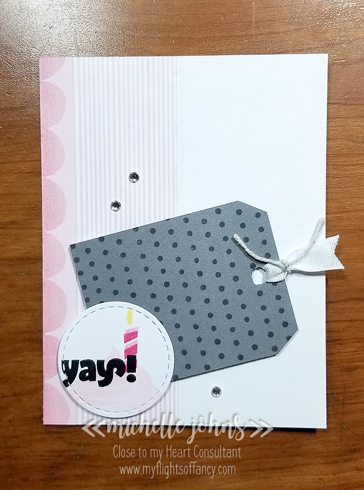
My first card is very ‘girly’ card. Lots of pinks and greys.

My tag is just a pewter cardstock that I trimmed the corners off of, to match some tags that I have in my stash. I punched a hole with just a hand held punch. Then I used a bit of washi and taped it to a sheet of lined paper, and used the line of dots from the Years of Sweetness stamp set to add some interest. Check it out!

I just alternated where the dots fell, so they weren’t straight lines from the top to the bottom!

I used some white ribbon and mink twine for the punched end, and I added a bit of bling with some sparkles.

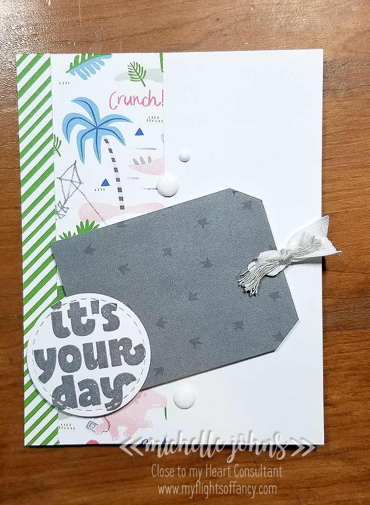
My second card is much more ‘boyish’ looking, though it would work for boys or girls. Unfortunately, most of the dinos are hidden under the other elements!

I used the white ribbon again, but paired it with some thick whisper twine. The tag already had the dino feet on it, so I didn’t do any stamping there. To finish it off, I used some of the black and white dots.

I used the same Years of Sweetness set for the sentiments on both cards. On the girl card I stamped the cupcake frosting in ballerina, the candle in first and second generation raspberry ink, and the flame in lemon ink. The Yay was stamped in archival black. On the boy card, the sentiment is stamped in pewter ink. The sentiments are stamped on circles cut with the stitched circles thin cuts.

I hope you have liked my cards today, I would love it if you left me a comment to let me know what you think, or what you might have done differently! (everyone would tweak something just a smidge!)

Next up, is Haley! So, hop on over to her blog, and leave her some love too!

~ Michelle

September SOTM – Just Treats

Welcome to the September Stamp of the Month Blog hop! This month we have more than 20 consultants sharing their fun projects with you! Today you should have arrived from Katy’s blog. If not, that’s ok, it’s a large circle, and you will get back there! This month’s stamp set is called “Just Treats“. It has 22 images on it, and is just fantastic! Just take a look!

You will be able to do so much with this set! It covers treats for each of the seasons and holidays for the remainder of the year! I will be showing so many options with this set! I can’t wait for you to see them and tell me what you think!

Let’s get to showing you what I came up with for this fun hop, now shall we?

This card is a little ‘extra’, because I had the thought of what I wanted on the inside, before I designed the rest of the outside. While I know it isn’t fall just yet, (I know, Erin, I know!) but there is pumpkin spice everything around me already, so I just had to go with a fall theme for my first card! (at least it doesn’t actually mention pumpkin in it . . . )

I used the newly available Grateful For You paper pack on the front of this card. I thought these colors went together so well! The design for the front is from the MIFYH Volume 2, pattern 23. (These books are so very handy!) Popped up the sentiment with foam tape and the cup with some thin foam dots. Add a bit of burlap ribbon, and you have a beautiful card!

Some things that I used that you may not notice or not see include the Golden Yellow, Warm Grey, Mahogany, and colorless blender ShinHan Markers, Shimmer brush, Archival black ink, Non Stick Microtip Scissors, Piercing tool, Journal pen, tweezers, and liquid glass. Scroll down further to hear how I put this fun card together! But, before you do that, check out the inside of this card!
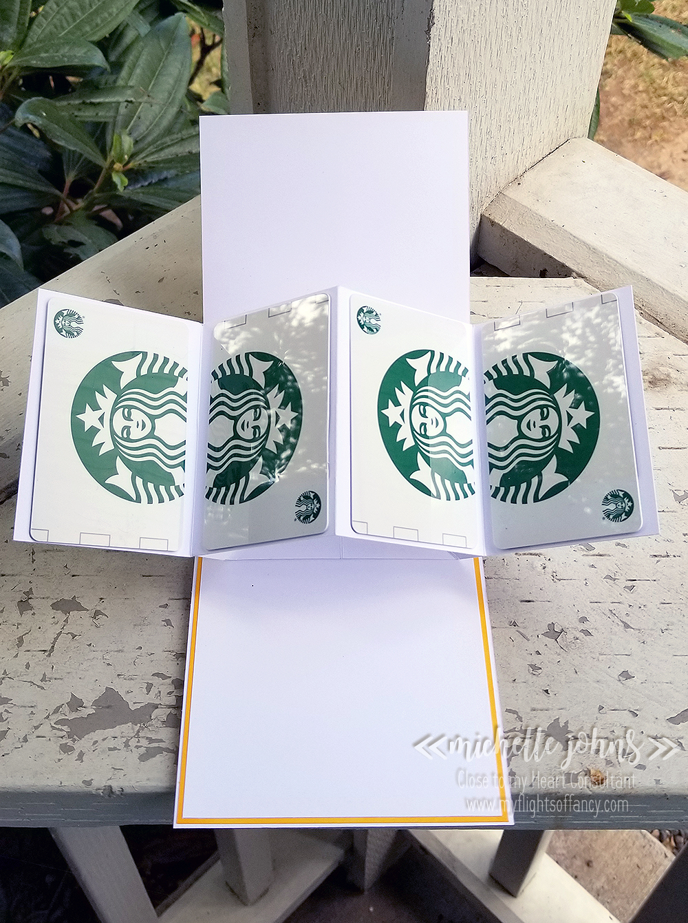
My daughter was gifted a 4 pack of these coffee cards (not naming, since that might be a no-no). And I thought that it would be really fun to make something to be able to gift something like this in the future! (these ones are used, but I will replace them with new ones (or reload these ones) when I gift the card. This card works (and will sit like this) because of the number of layers that this card has, and the strength of the liquid glass.

The inside has two layers on top of the card base. The front also has two full layers (plus a few extra pieces) on top of the card base. This makes sure that the front and back both stay flat when you are opening the card, and don’t bend, making it harder to get the card open.

Thanks so much for stopping by! Next up is Melissa! Check out her blog! If you would like more details on how I made my card, just keep reading below!

~ : ~ : ~ : ~ : ~ : ~ : ~ : ~ : ~ : ~ : ~ : ~ : ~ : ~ : ~ : ~ : ~ : ~ : ~ : ~ : ~ : ~ : ~ : ~

So, I am needing to replace some of my cardstock . . . specifically saffron and sapphire! LOL Those are the two colors that match the papers that I chose for this card. So, what to do? I knew I needed that layer on there, so I could have the stiffness that this card needed for that fun fold on the inside of the card. So, I went to my shinhan markers, to see what would work. I don’t have any dark blue markers (I could mix colors to get the right blue, but didn’t want to) so I was looking at the yellows. The Golden Yellow matches decently enough! So, I cut the layer from white daisy cardstock and used the Golden Yellow marker along the edges. No need to color the center of the cardstock, as it won’t be seen. If I had done fewer layers of color, it would have matched a bit more closely. I did this for both the outside and inside of the card.

I also used that same yellow to color in the letters on the stamp. I used the Mahogany to color in the little drops on the sentiment to look like coffee or cocoa. The Warm grey I used to create a bit of a shadow under the cup, however, because it was so dark, I used the colorless blender to soften it and move some of the color a bit further down. I used the shimmer brush on the whipped cream, just to give it a little pizzazz! Now, to get your cup to look like this, you will need to create a mask of the whipped cream, and stamp it first, cover with the mask, and then stamp the cup. That way the back of the cup isn’t seen in the whipped cream.

If you notice, my cup is ‘backwards’. I did this on purpose too! One of the benefits of cutting out your element, is that you can make some changes to it. So, after I stamped the whipped cream and the cup, I cut it out, chopping off the handle in the process (it makes a cute bowl, btw!). Then I stamped it again on a scrap of white daisy cardstock, and cut that out. Before I glued it all together, I went over the edges with the journaling pen, it gives the stamped image just that much more omph. Then I used the liquid glass to attach the handle to the other side of the mug.

This card is a “Pop and Twist” card. I modified mine from a few different videos (and would probably do a few more modifications for the next one). It will be one of the fun cards I offer in my card workshop that will happen a bit later this month! So you will want to watch for that info, coming soon!

Thanks again for stopping by! I hope you liked my card! Let me know what you think!

~Michelle

Time to Gear Up

Have you seen the hostess rewards stamps in the Seasonal Expressions book? These are only available until the end of August, so if you haven’t seen them, run and go look! If you have seen them, and haven’t gotten them yet, you will definitely want to grab a couple of friends and put in a party order, so that you can get them! Just ask me what you need to do to have that happen!

Today I am working with the Dino-mite Birthday stamp set. I LOVE the little dinosaur in this set, but wanted to play along with the Heavy Metal challenge with Heart 2 Heart Challenges. So, I got to playing!! I started with the Make it from your Heart, volume 4, again. And used pattern 10, just like I did with my notebook, here.

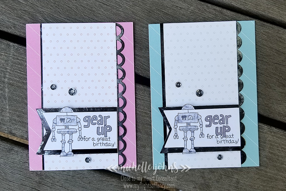
I was going to make just one card, but couldn’t just go with a boy card, so believe it or not, both of these cards are made with the same two pieces of paper, just flipped to use the opposite side!

I started with the boy card, and didn’t get very far before I had to go with a girl card too!

Now, believe it or not, this metal paper is the gold foil cardstock! What?!?! Right? I am LOVING how this turned out!! And believe it or not, it was SUPER simple to do!! I really wanted an ‘old’ and patina type look to my metal, and, as you know, we don’t carry anything like that in the idea book. However, we do have LOTS of different supplies to be able to do many fun things!

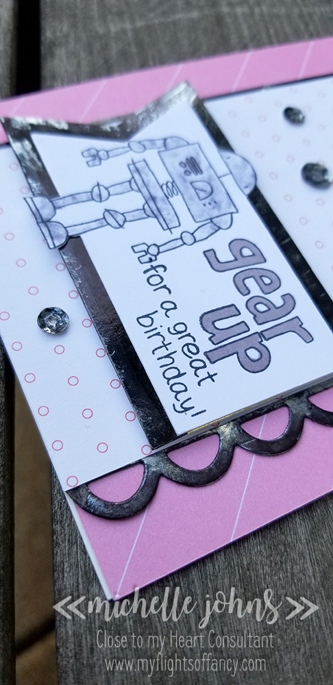
So, this is what I did. . . First I cut the scallop sides with the dies, from the gold foil cardstock. Then I tried a couple if things, but the one that worked the best was to use the black shinhan marker to cover the gold side, then flip it over and press it into a piece of scrap paper, to remove a bit of the black. On the spots that weren’t quite removed enough, I took an alcohol wipe and blotted in spots to make it a bit more worn looking. Then I did the same thing for a straight piece for each card. (actually, I did one piece and then split it in half to put the left edge on the cards). And then I repeated it yet again for a banner mat. I just LOVE how this worked out!! I don’t think I can tell you guys how much I liked how well it worked!

Now, this robot, was just as much work . . but turned out equally as well! So, first I measured how big the 2nd largest banner die cut was. Compared that to how tall my robot was. Then I cut some pieces to be about 2 1/4″ tall and 4″ long. This gives me enough height to have my entire robot on. Then I lined up my die to the left of my robot, and did a partial die cut. Then continued the straight cuts on the right side of my robot with my paper trimmer. Next, I trimmed the rest of the robot out with my micro-tip scissors. This gives a fun popped out look.

Now, to back up just a bit, after I stamped my robot, I decided I needed to add some color to him, but didn’t want to just color him in. I know, I know, I have to be a pain, right? So, I grabbed a post it note, stamped my robot twice, and then cut out the body parts that are colored in. I did the head and the hips/legs on one, and the chest/arms on another. This made sure my post it had a little bit of stability, as I was using the negative spaces for this technique. So, I covered my robots with my post it notes (this ended up with two passes per robot) and then squished my archival black in pad together to get some ink on the lid, grabbed a baby wipe and ‘cleaned up’ the lid. Next I dabbed the baby wipe over the robot to give the mottled grey coloring. I really like that he isn’t just one solid color.

So, these cards needed a bit more ‘bling’ . . . but with as old and grungy as the rest of the card already was, I couldn’t very well just add something sparkly and ‘new’. . . . so I grabbed some of the bronze sequins and did the same thing as the gold foil cardstock! I added some of the black shinhan marker on top, and then dabbed with an alcohol pad to get the old look.

Oh, and not to forget using the markers to add a bit on the chest of the robot and coloring in the “gear up” on these cards. I did do some stamp surgery to be able to get the sentiment to be able to fit onto the banner. When I was stamping the ‘boy’ card, I started a bit too low, so then I used a mask to put the smaller part of the sentiment “under” the block letter. I kind of like how it turned out!

So, please, let me know what you think of these fun cards! Do YOU need to have a party so that you can get this fun stamp set?

~ Michelle

Items used to make these cards:

Value pack card base (and envelope)
Whimsy fundamentals paper pack (retiring 8/31/18)
Gold Foil Cardstock
White Daisy Cardstock
Black Shinhan Marker
Archival Black Ink
Memento Black Ink (retiring 8/31/18)
Warm Grey Shinhan Marker
Bronze Sequins
Liquid Glass
Fiskars Paper Trimmer
Microtip Nonstick Scissors
– baby wipe
– alcohol wipe