The other morning, one of my girls called and wanted to go out to dinner, as a whole family. Seeing as I don’t get to see them very often, now that they have moved out, I agreed!
While I didn’t get many photos, they were fun, and the evening was great!
I started with the Vistual Texture pattern from the Cherish book. These books are so fun! Can you see what I did with the pattern to get to my finished page?
cherish-visual-texture <–Click here to download a PDF of this pattern!
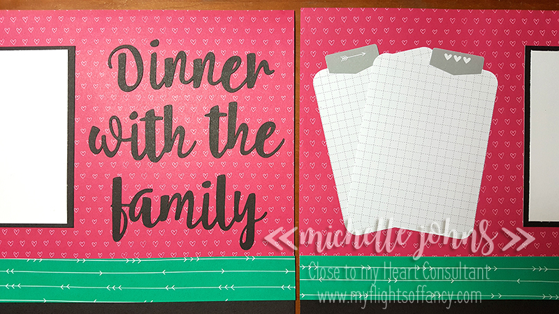
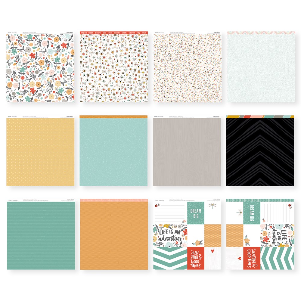
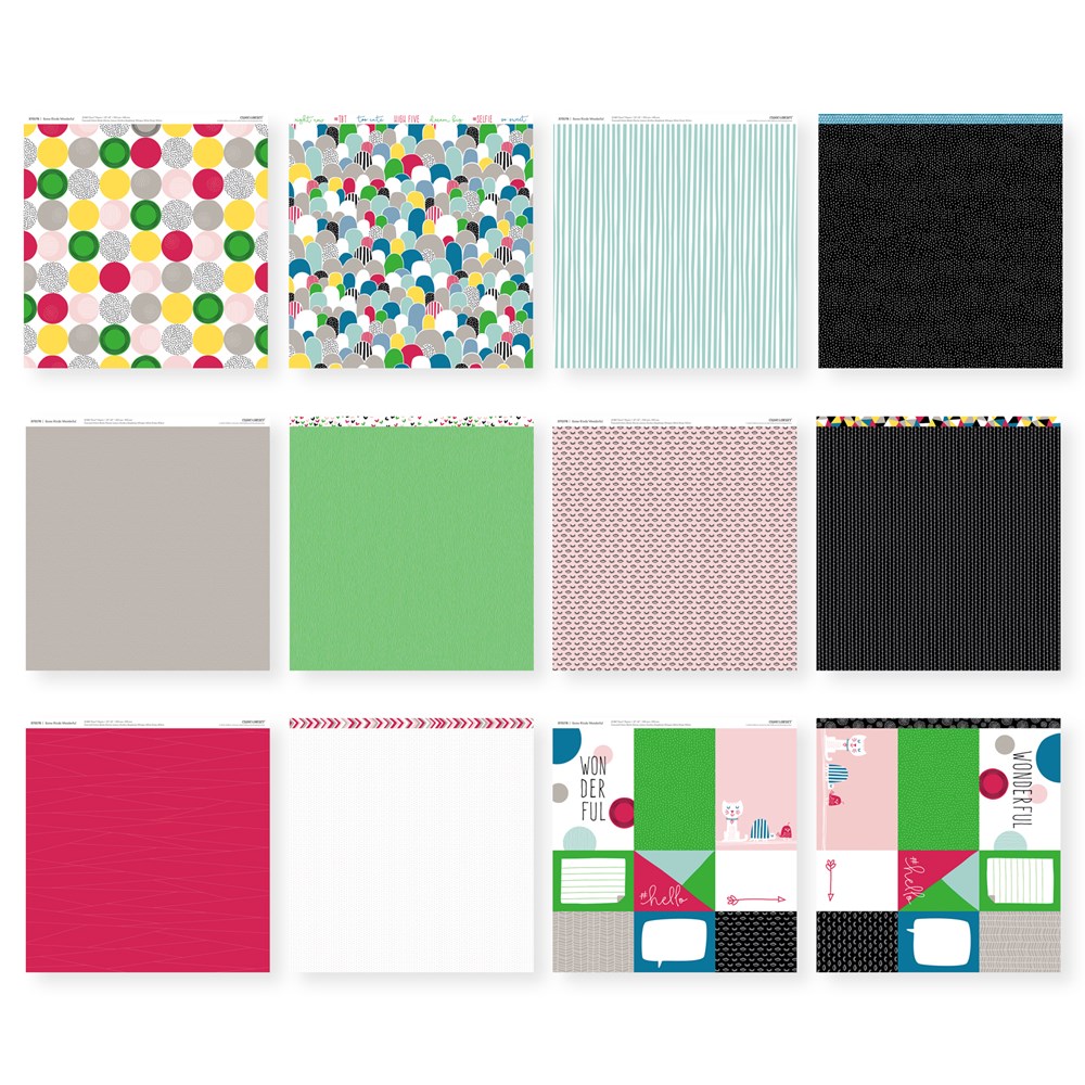
I used the Adventure Fundamentals paper pack. The raspberry and willow are so pretty together, don’t you think? I have the tabbed journaling cards there to add some journaling to (which I WILL do, after I get the photos printed and added to the page)
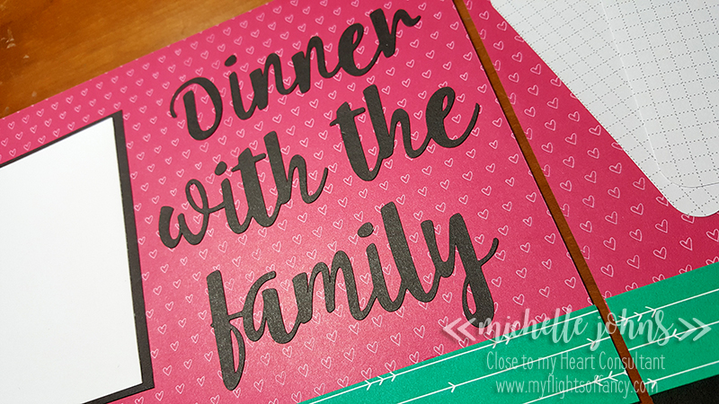
Like the other day, I used my explore to cut the title. This time I used the Umbrella Regular font on CTMH’s Black Cardstock. I even have a little hint to share with you about it.
All of CTMH’s cardstocks have a white core. This is done so that the color on the cardstock is consistant. This also means that when you cut it, you can see the white on the inside. Sometimes, that is not really what you want, and you ink the edges to remove some of the white (or hide it a bit). However, with this title, I didn’t want to have to edge all the little bits here and there. So, let me show you my fun and easy trick!
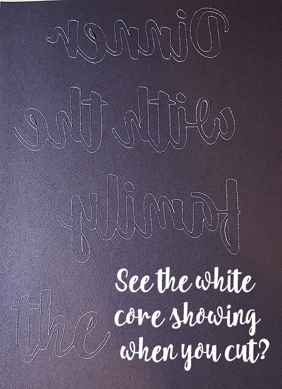
This is the title cut, (mirrored) while still on my cricut mat. You can see that the word “the” is repeated, this was my “test” sample to show you. As you can see, the white shows already, before I take it off the mat.

So, after I take them off the mat, and put them onto the remainder of the black cardstock (yeah, it doesn’t look like it, because of the light), you can see the differences. (the arrows help some). On the left, is a fairly straight above photo. You can see on the lower word, there are many more white spots vs. the upper one.
On the right photo, the angle is slightly moved to a lower position, and you can see even more of the white showing.
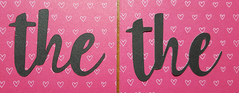
Here is a comparison of the words on the same background paper, with better lighting. While very similar, you can still see more white on the one on the right. So, my little trick to share with you is to mirror your white cored paper to minimize the amount of white that shows!
I will be having the photos printed soon, and will show an updated photo on another post, so keep watch for it!
Now, I’ve shown you the wreath that is a special for January, but have you seen the Stamp of the Month? It is a GREAT stamp to add to your collection if you love making valentines, or plan on doing pages for valentines (Kids? Grandkids? that special someone?). It’s just $5 with a $50 purchase, or you can get it by itself for just $17.95.

I hope your week is flying by! I know it has been for me! Saturday I have a crop coming up for the local ladies. Are you nearby? I have a few spots open still! Just let me know if you are interested!
Until tomorrow!
~Michelle


